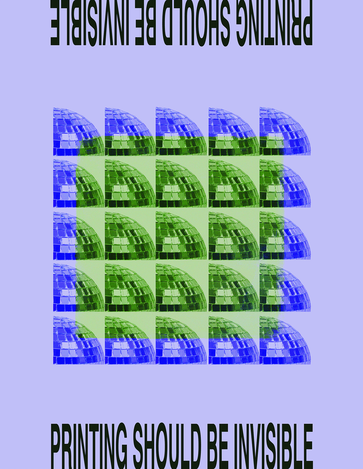
For part one of this assignment, I created a poster where we had to choose two different popular vernaculars, include elements of each, do something a design professor told you you must never do, and make the poster work right side up and upside down. I also had to choose to include either "printing should be invisible" or "cult of the ugly." The two vernaculars I chose are Swiss Design and Pop Art while choosing to include "printing should be invisible."
For part 2 of this project, I had to choose a Brian Eno oblique strategy, one of Aristotle’s Alterations, and a making tool we have never used before. The random Brian Eno strategy that I got at random was to cut a vital connection, thus I cut the type on the poster in half. The Aristotle's Alteration that I chose was destruction. For this I distorted the poster in photoshop. The making tool that I have never used before was Adobe Bridge.
Older Versions:


First Version For Part One: